The Flex Banner Force
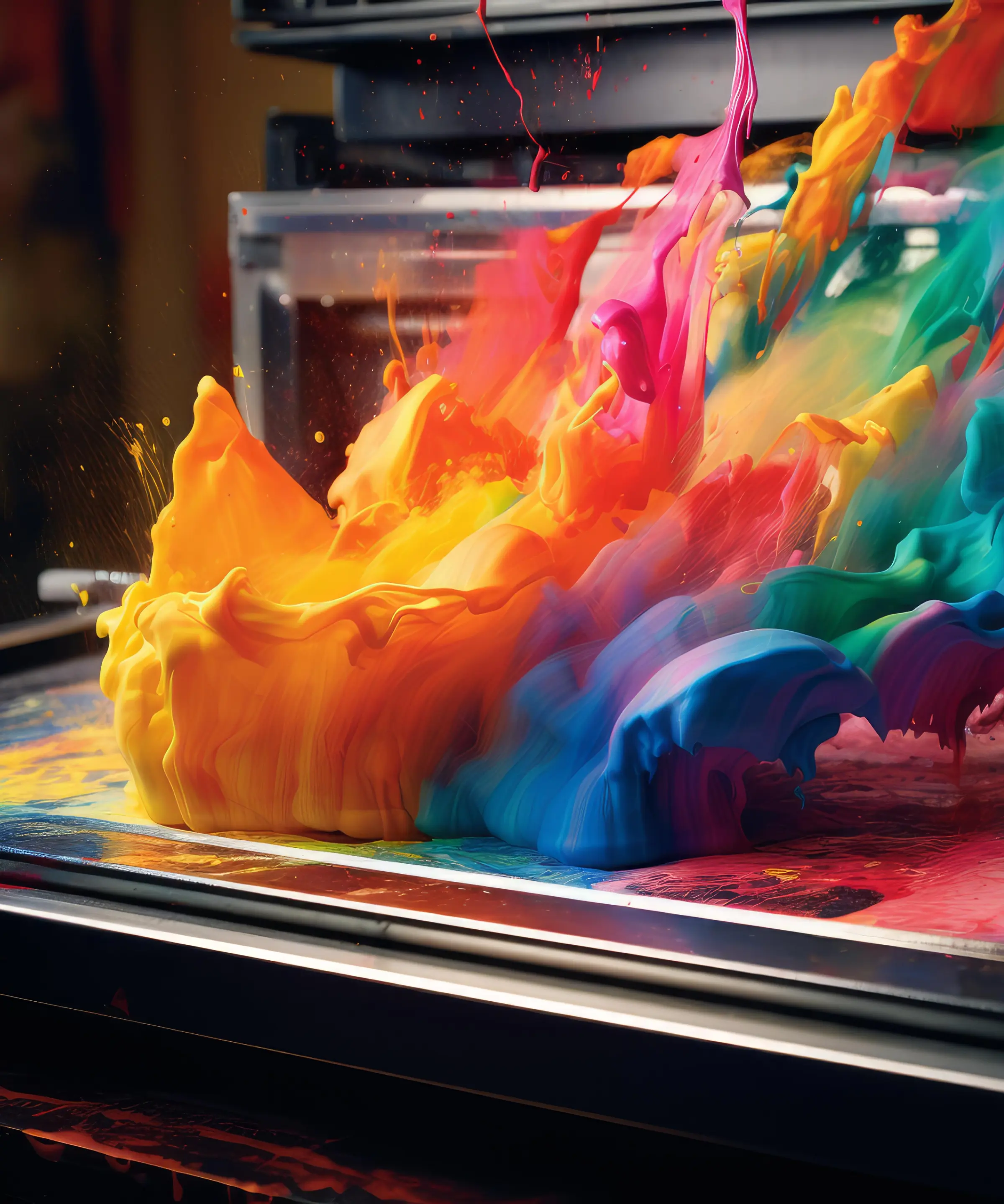
In this world that never stops moving, making a great first impression is crucial, and flex banners stand out among various advertisements. Known for their durability, lightweight design, and customizability, they are favored by businesses and event organizers. Flex banners serve as blank canvases, enhanced by vibrant colors and high-definition graphics that create a significant visual impact.
Whether along busy roads or at lively trade shows, they leave a lasting impression. With the right design, they capture attention before a single word is read.
The Art of Visual Storytelling
We are irresistibly enticed by images and a single graphic can evoke emotions, conceptions better than text can possibly do. Images of best quality, striking colors and layout changes are what make the coin turn around.Take a note of the psychology of colors.
- Red gives energy and impatience, it is perfect for sales or promotions.
- For corporate banners, go for blue to make it more trustworthy and businesslike.
- Venenatis faucibus non maecenas feugiat amet tellus lorem text
- Green is seen as growth and fresh so that is why it is mostly used for green campaigns with the eco theme.
- Choose your palette right and for sure your brand will , in addition with your message that will make it a whole design.
NOTE : Negative space or the areas of your layout that you leave alone as such is another tremendous tool to play. It just helps in stressing the important things and stops your banner losing touch.
Typography That Speaks Volumes
Text in your banner is the voice of your brand or business. Font to pen, every choice counts.
Keep it short and sweet, my friend. Long paragraphs are not meant for a flex banner. Rather, deliver the messaging in a crisp way.
The key details should be highlighted; event name, date and a call to action. Something like "Grand Opening: This Saturday" or "30% Off – GRAB While it Last" communicate immediacy and importance instantly.
FYI: Avoid very fancy or thin fonts that can get in the way of clarity.
Branding That Resonates
Adding the logo of the franchise, brand colors and fonts that will be a part of your brand extension that will help in keeping the same branding throughout other marketing materials.
Not only does consistent branding define who you are, but it also lends a level of trust to your audience.
Like walking into a store and finding a banner that is as close to the aesthetics as the brand. And colors, fonts and visuals seamlessly sync with each other. This level of cohesion does produce a professional and sleek image, one that appeals to clients.
Designing for Maximum Impact
Every flex banner is different, designed for individual purposes. You must know the context, where banners will be served will make all the difference.
Outdoor banners for the most part want to be legible. Large font sizes and bright colours that can be read from far away are vital. Of course, contrast goes a long way here-light text on a dark background or vice versa for legibility. In special indoor banners, where viewers are much closer you can use methods and shapes of details that are harder to notice.
Something hung way up high above a street is going to be very different looking than what you see at eye level in a banner. Typically, placing important information at the top of the page will allow for it to be readable regardless of angle. And that’s why a looming factor to consider is viewing angle.
The Finishing Touches
The way your flex banner is finished is going to determine how long it lasts and how it looks.
Some of the finish options are grommets, hemmed sides, and pole pockets are high in demand. All of them have their purpose in making sure your banner is tight and secure or adding an executive quality touch.
Consider lamination as an added protection for banners that will face weather elements. Besides, it not only increases the durability but also offers a glossy material that makes colors stand out. Wind slits are something else you can use for exposed outdoor banners or flags to let breeze through it and avoid the tear factor.
Avoiding Common Pitfalls
One of the most common mistakes is overloading your design with too much information. A banner that is over the top with cluster information will not be easily readable and will fail for communicating.
WARNING:Not paying enough attention to the Image quality OR Low resolution graphics will look pixelated and clunky when printed at any significant size
Trends in Flex Banner Design
Besides being trendy, this method of presentation promotes readability as well. A trend that is currently seeing a lot of traction is QR codes.
In immediate viewer interaction, such a way of engaging allows viewers to interact with your brand via visiting your website or following you on social media and more importantly getting exclusive offers.
And eco-friendly materials and printing processes are being tested by businesses to help reduce what they send to landfill. Such a change also matches consumer demand for sustainable brands.
A Step Towards Excellence
It needs to know your audience at a very deep level, to have a solid message and be creative. Combined with some designs, typography and branding together can set off those banners that people notice one time, and again as well.
A flex banner, when applied well, not only transcends being just a medium of advertising, It transforms into an exceptionally strong tool for communicating your story, your audience and your call to action.
Take your time, have fun with the ideas, and maybe even consult a pro—because the best banners are the ones that make people stop, smile, and say, ‘Now that’s different!
Quotes


Leave A Reply